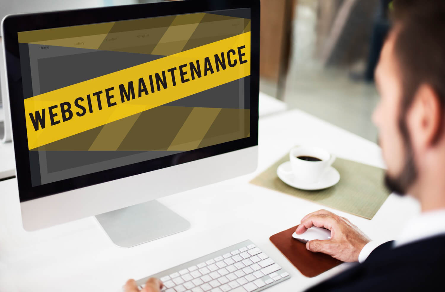
5 Common Mistakes That Are Killing Your Site’s Potential
Is your website underperforming? Hidden Common mistakes could be driving visitors away. Most sites suffer due to slow loading speed, unclear design, and poor mobile views. These issues might sound small, but they cause big trouble. These problems hold visitors back from exploring and taking action.
When a site is hard to use, people leave quickly. This means fewer visitors, fewer sales, and lower trust. These problems often go unnoticed, which quietly reduces your site’s success.
That’s why you need to find and fix these mistakes issues quickly. A best Web development company knows how to fix these issues. They help you in making your site faster, clearer, and convenient.
Making your site better can result in improved outcomes and happier visitors. It’s not just about looks, it’s about giving users a smooth experience.
Read the blog and explore the most common website mistakes that kill your site’s potential. In the end, you will also know how you can fix these issues so that your business keeps growing and succeeding.
Also Read: Staying Ahead in Online Branding
Common Website Errors that Kill Your Site’s Potential
Mistake #1: Ignoring Page Speed Optimisation
Did you know that 53% of visitors abandon sites that take longer than 3 seconds to load? That’s more than half! This means over half your potential customers leave before seeing what you offer. People don’t like waiting, especially online.
A slow website can hurt your business. It makes visitors leave, and search engines like Google may not show your site in the top results. This means fewer people find you.
Why this happens:-
There are a few reasons websites become slow:
- The pictures are too big and not compressed.
- Too much code, like heavy JavaScript and CSS, blocks the page from loading fast.
- The website doesn’t load things only when needed. This means they have to reload everything each time they visit.
These problems make your site take longer to show up on the screen.
How to fix it:-
The good news is that now these mistakes problems can easily be fixed! Use tools like:
- Google PageSpeed Insights
- GTmetrix
- WebPageTest
These tools show what’s making your site slow.
Take action by:
- Shrinking image sizes and using the WebP format
- Loading images and videos only when needed (this is called lazy loading)
- Saving website parts in the visitor’s browser (called browser caching)
Example
O’Reilly Media, a renowned technology publisher, faced challenges with slow website performance. By implementing Radware’s FastView cloud-based service, they achieved remarkable results:
- Sub-2-Second Load Times: 87% of their visitors experienced page loads in under two seconds.
- Significant Performance Gains: Over a 600% improvement in moving users to sub-2-second load times.
This transformation led to enhanced user satisfaction and increased engagement.
Mistake #2: Neglecting Mobile Responsiveness
Over 60% of web traffic now comes through mobile phones. That means most people visit websites using mobile devices, not through big computer screens.
But here’s the problem: some websites only look good on desktops. When people use their phones to visit, text looks too small, buttons are hard to press, and the layout looks messy. Google even says it won’t rank websites high if they aren’t mobile-friendly.
Why this happens:-
- Websites are often designed only for desktops, not for smaller mobile screens.
- Developers may skip testing on different devices.
- Text, images, and buttons may not resize properly on phones.
- Navigation can become confusing or hard to use on touchscreens.
How to fix it:-
- Use a mobile-first design approach from the beginning.
- Test your site on real devices or tools like BrowserStack or Chrome DevTools.
- Use responsive layouts that adjust to screen sizes automatically.
- Keep layouts clean and simple for smaller screens.
Pro Tips for Better Mobile Design:-
- Make the menus easy to find and simple to use.
- Make the buttons big and easy to tap.
- Choose easy-to-read text sizes for small screens.
- Avoid pop-ups that are hard to close on a small screen.
Mistake #3: Confusing Navigation
Have you ever visited a site and didn’t know where to click? It happens many times. Visitors will choose to depart from websites when they fail to find the information that they were looking for. It is one of the common website mistakes that users encounter.
A website should be like a map that’s easy to follow. If the menu has too many buttons, weird words, or no search bar, people get confused. They don’t want to guess, they just want to click and move ahead!
Why this happens:-
- The website menu has too many options—more than 7 is too much!
- The labels (words on the buttons) are not clear.
- Visitors cannot use a search bar to find specific items on the website.
- The website has no headings or clear sections to guide people.
How to fix it:-
- Keep menus short—use only 5 to 7 items in your main menu.
- Use simple words for menu items that everyone understands.
- Add a search bar at the top so visitors can find things easily.
- Use clear headings on each page to guide people like street signs.
Making these small changes can turn a confusing site into a friendly one. Visitors will stay longer, enjoy browsing, and are more likely to buy or sign up.
Mistake #4: Inconsistent Branding & Design
A website appearance that differs between pages reduces visitor trust in the business. Changes in fonts, colours, and logos can create confusion and reduce trust.
Studies show that visual consistency helps people to remember and trust a brand. If your website feels disjointed, users may leave without exploring further.
Why this happens:-
- Different team members create pages without following the same design rules.
- There’s no style guide to standardise fonts, colours, or logo usage.
- Older pages aren’t updated when the brand changes.
- Design decisions are made without checking for consistency.
How to fix it:-
- Create a style that guides outlines and rules for fonts, colours, tone of voice, and logos.
- Audit all pages to ensure they follow your design standards.
- Use one template for blog posts, product listings, and call-to-action buttons.
Example:-
AirAsia once displayed three different logos across its site. This led to confusion and made the brand appear unprofessional. After updating and unifying its branding, user experience, and trust improved.
Also Read: What is a Static Website? Advantages and Disadvantages!
Mistake #5: Inconsistent Cross-Browser Testing
Not all visitors use the same browser. While Chrome is popular, many still use Safari, Firefox, and others. Studies show that about 8% of global web traffic comes from non-Chrome browsers. If your website doesn’t work well on these, it can cause major website performance issues and lead to a loss of visitors.
Why this happens:-
- Browser Differences: Each browser processes code differently. What looks good in one browser might break in another.
- Missing Tests: Developers often forget to test websites on multiple browsers.
- Special Browser Code: Some websites use features that only work on certain browsers without adding fallback options for others.
How to fix it:-
- Use tools like BrowserStack to check how your website appears on different browsers.
- Add specific browser prefixes to your CSS code for better compatibility.
- Apply CSS Resets: Tools like Normalize.css help keep design elements consistent across browsers.
- Write Standard Code: Clean, updated code ensures that most browsers can read your website properly.
- Keep Tools Updated: Always update your website tools and libraries so they work with the latest browser versions.
Conclusion
Many websites face problems that stop people from staying or coming back. We talked about 5 big website mistakes: slow loading, bad mobile views, confusing buttons, messy design, and not working on all browsers.
But don’t worry! These problems can be fixed.
Fixing website mistakes can be solved in simple way these issues helps people use your website easily. When the site loads fast, looks the same everywhere, and is easy to tap and read, more people will stay.
Checking and improving these parts of your website makes a big difference. It helps more visitors to enjoy your site and builds trust in your business.